When preparing JSesh 7.9 distribution, a number of questions were raised about the sphinx signs E151 E151 (and variants).
")
- the first question was about the beard. The great god Harmakhis, also known as Abu-el-Hol1, is usually represented with a so-called divine beard, and the version of JSesh 7.6.1 distribution follows this scheme. But most, if not all, hieroglyphs representing a sphinx use a straight beard (or, quite often, don't represent the beard);
- having opened the pandora box, other questions were raised. For instance, the JSesh sphinxes have a khat headdress... but it soon appeared that all sphinx representations (hieroglyphs or full-scale) sport a nemes;
- JSesh variants of E151 did not share the same style. At some point, a more detailled sign was used as basis for most variants, but I decided to keep the old E151 shape, which I preferred.
Trying to fix the sign, I started to look at available versions. The problem when looking glyphs examples to include in a font is that, most of the time, actual signs are not very detailled, and might not fit the style of the rest of the font.
P. Dils sent me quite a few examples; I found others looking in the Karnak Project, looking for the word šps and for nḫ.t-nb=f. The name of Nectanebo I is quite likely to be found in monumental inscriptions (and alas, often, mutilated).
Finally, I found a really nice version of the sign on the British Museum web site, looking for Nectanebo I.
But I wasn't satisfied with the zoomed version of the royal cartouche, as it was too pixelized for my taste.
The drawing process
When I draw a sign, I will often mix fac-simile of actual sources and parts of existing signs in the font, in order to have something reasonably accurate, but also coherent with the rest of the signs.
Possible sources
I started creating simple versions of the Louvre version:

and a very rough version of the British Museum version:

I was not very optimistic about this one, because the details were difficult to see and to trace. I guess a professionnal drawer would be more at ease.
As it seemed that I was once again going to use a full-scale representation to create a hieroglyph, I decided to look at Davies' edition of Rekhmirê, where I knew I would find a number of sphinxes. Drawn signs are easier to trace and give better results than carved ones in general.
This gave me the following version:

Drawing a first version
Then, I started to create a glyph. The idea was to use the Rekhmire version, but to mix it with the head I use for A40 and the like.
I did play with line width (which must be quite large for glyphs, simplified the sign to get read of details which would disapear anyway in a font sign). The following SVG file is an intermediary example of what I had:

The black parts are (currently) regular lines. The red parts are already filled shapes.
Then, I proceeded to make this drawing into a sign JSesh can use. The result is the following:

I wasn't completely satisfied. When I used the sign in actual text, I found that the sign was a bit difficult to read. The lines are too thin (but this can be fixed), and, more problematic, the head of the sphinx becomes a bit difficult to identify: 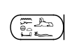
Comparing the Rekhmire figure with the hieroglyph from BM EA 22, it appeared that the sign proportions are different. The head in the hieroglyphic version is somehow larger. Another point is that most details are gone, which might hint that the rough outline we get from the BM version might be sufficient after all.
Hence, I had a try with the BM EA 22 version, still reusing the same face.
The preliminary drawing gives:

I then edit the picture a little bit. I modify the back to make it more readable, in particular.
The result is:

Note that the tail doesn't appear. Having a look at most sphinx hieroglyphic versions, the tail is either:
- hidden;
- mostly hidden, with only the tip of the tail visible (which is the case in the Louvre examples);
- or fits in frame of the hind leg of the sign.
I'm open for comments about the sign. I feel it gives reasonnable results in texts: 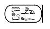
-
if you haven't read Christiane Zivie-Coche's book, Sphinx! le Père la terreur, go and fetch a copy right now :-) ↩