Dr. Peter Dils, from Leipzig, sent me (a long time ago) a list of signs for which the Hieroglyphica had significantly different shapes from the signs in JSesh.
Some of those differences hint about problems in the way we encode hieroglyphs - basically, upon what should be encoded or not. But others are really error in the JSesh shape, and should be fixed.
I have extracted from the list those signs which, in my judgment, are in most urgent need of redrawing.
1. Non problematic signs
A sign can be modified in a font without any problem if the change does not change the identity of the sign and its value. Basically, if it doesn't break the encoding of existing texts.
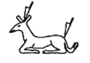
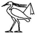
For instance, the shape of M3 is  in JSesh. When I started creating the original font, my idea was that I would use facsimile from actual ramesside texts. The problem is that, in the current fonts, you want to choose a typical shape, not just any existing shape. At that time, I was mostly interested in making linguistic databases, and the idea of covering the whole extended library was a distant dream. If you don't have many variants of the same sign, then you can choose one of them more or less freely, which is what I did. But, now, we have added some of the variants from the Hieroglyphica to the font, so the shape can become meaningful. To be honest, I think that in the case of M3, having variants is not such a good idea.
I'm pretty sure that nobody has chosen to use the M3 code instead of another one because of its actual shape, but because it encodes the ḫt/wood sign. Changing the shape of the sign will not invalidate any existing encoding, so I can do it without problem.
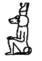
In other cases, the change might be significant, but I'm pretty sure 90% of occurrences correspond to the version in the Hieroglyphica. For instance,  should have the “royal” (straight) beard, not the “divine” beard, as it designates a king. The JSesh shape is simply due to the A40 A40 sign, which has the divine beard, and whose original is a beautiful hieroglyph from Sethy the first's tomb. We reused A40 as the basis for other seated gods and kings signs. The funny thing is that the Hieroglyphica has the same error in reverse, with A40 having the “wrong” beard.
There might be a few cases, for instance in Osirian contexts, where a sign with the exact shape of might perhaps be used (I don't have actual evidence at end right now). But it's a question of compromise. All choices have shortcomings:
- the sign as is has a wrong shape for most occurrences (if not all) occurrences;
- adding a new code with the correct shape would be a worse solution, as it would make all encodings which use A41 wrong;
- changing the current shape to use the correct one might break a few encodings, but it's doubtful. If the current shape does really exist, a new code could be created for it, provided that the change is documented.
The only good approach is the last one. It entails however that we need to document changes in the JSesh encoding.
In other cases, the change will be a breaking change. For instance, JSesh currently has swapped  B1J and
  B1K from the Manuel de Codage. I could decide to keep the current shapes, considering that it's likely that texts have been encoded with them. But the IFAO and an number of scholars use JSesh with fonts derived from the original Winglyph/Hieroglyphica shapes, and have probably the original shapes. As the IFAO is probably a large source of Ptolemaic texts, I consider that the least problematic solution is to change the JSesh shapes to match the original ones, and document the change.
Top priority fixes
Those signs must be fixed quickly. In some case, the problem is a bit minor, but the sign is a frequent one. In other cases, the modification is quite easy to make, and should be done quickly. And finally, some signs are completely wrong.
-
A41 : royal beard instead of divine beard;
-
 A42 : royal beard instead of divine beard;
 -
 A210 : fix the shape of the wood sign
 -
 A255 : add a small running Apis-bull
 -
 A357 : both "sw" sign in the same orientation
 -
 B8G : probably writing implement (ok, that's what I see in the present shape);
 -
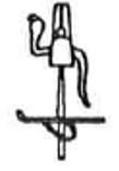
 B28 : hands toward the face of the (mourner) figure - note that it's possibly a problematic sign;
 -
 C11L : fix position of the ḥḥ sign ;
 -
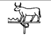
 E1 : fix the sign's horns
 -
 E8A : fix the sign's hears
 -
 E9B : the sign should be almost standing
 -
 E154A : momiform shape
 -
 E187 : should have a ankh shaped collar
 -
 F27B : fix tail shape in JSesh.
 -
 G14A change feet shape (and lots of other vulture signs)
 -
 G204 : no beard (female)
 -
 G204A : no beard
 -
 G302 : holds a lotus leaf, doesn't feed chicks
 -
 H44 : more curved neck ;
 -
 H45 : without the three dots
 -
 I70B : horizontal curves (the current JSesh sign is the same as I70D)
 -
M3 : fix shape
-
 M3B : fix shape
 -
 M3E : fix shape
 -
 M8D : four flowers, not three
 -
 N36D : wildly different form; JSesh form is same as N36C
 -
 O19 : move closer to Gardiner's shape?
 -
 P8A : get the same oar shape as hieroglyphica
 -
 P63 : not the same as P66
 -
 Q45 : four feathers
 -
 Q47 : not a bull's head
 -
 S60A : completely different sign? change or keep?
 -
 S65 : damaged sign in JSesh
 -
 T77 : with snake
 -
 V2 : use Gardine's shape (loop above horizontal stroke)
 -
 W17C quite different details
 -
 W18A quite different details
 -
 W59A different vase
 -
 X2 : fix shape a little
 -
 Aa1A add a version of Aa1 with oblique strokes
 -
 Aa23B add transversal lines to vertical poles
Lower priority signs
Those signs should be fixed at some point, but it's not as mandatory in my opinion.
-
 A13E: make clearer it's an asiatic;
 -
 A194A : holds a short wooden hammer
 -
 E148K : change the knife orientation
 -
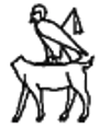
 E157A move the ankh in the claws of the sphinx
 -
 P54 : add sundisk to the falcon
 -
 S60 : Uraei on the ram's horns
 -
 T103A : change knife orientation
2. Missing signs
Late versions of the Hieroglyphica have added a number of signs which are not in JSesh. They is no problem in adding them (except that they need to be drawn, that is)
-
 E148M and
 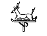 E148N
E148N -
 E207A
E207A -
 E295
E295 -
 E296
E296 -
 E297
E297 -
 F124B
F124B -
 G23A
G23A -
 G31F
G31F -
 G129D
G129D -
 G185A
G185A -
 G266A
G266A -
 I159A
I159A -
 I138
I138 -
 N6E (from Vector Office X)
 -
 O107B is JSesh O308
-
 O107C is JSesh O308A
-
 O354
O354 -
 O355
O355 -
 R18G
R18G -
 S204
S204 -
 S205
S205 -
 S206
S206 -
 T100A
T100A -
 V141
V141 -
 Y18D
Y18D -
 Z40 (from Vector Office X)
 -
 Z41 (from Vector Office X)
 -
 Aa81
Aa81
Signs N97A, N97B and N97C are compound signs for N18:X8 with a double stroke y) on the N18, N18:X8 and N102:X8. I'm not sure they deserve a code, but for compatibility reasons it would be nice.
3. Problematic signs
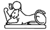
A239
This is a typical case of problem we meet when hieroglyphic fonts are extended. When the choice of signs is small, encoders might use the same sign for multiple uses... and in some cases, the ancient scribes could do the same.
Let's take the example of A239  . The original lead fonts of the IFAO has this shape:

Some colleagues complained about my rendering of A239, saying that the sign should be naked, as it is the child-god Ꞽḥy. If we look the Hieroglyphica fonts, and compare them to the IFAO font, we see that:
- there are a number of variants of A239 which are, without doubts, representations of Ꞽḥy (e.g. A240) (A240);
- some of those signs, e.g. A240 should be in the “C” family; Dimitry Meeks' classification (A = men, B=kings and human-shaped deities, C=women, D=non human headed deities) would improve things a little, except perhaps for A239 itself
- the IFAO font has two very similar signs: 30,7 and 30,8. The latter is probably naked, and has somehow more childish proportions, and thus might be Ꞽḥy:

Basically, we have:
- a sign, known from the Old Kingdom onwards, which shows a musician, and which is used as determinative for actual human musicians; the shape in the hieroglyphica corresponds to this sign;
- a sign showing the god Ꞽḥy, without crown. The sign should wear the lock of childhood, and is prototypically naked, at least in the Ptolemaic period. However, we can find clothed variants of the sign:
If (and probably when) we fix the problem, we will need to add a new sign, explicitly representing Ꞽḥy,probably in family A, as a variant of A239 or, more correctly A240. Family “C” would be better, but it would place different versions of Ꞽḥy in different families, which is somehow anoying.
Now, this will break lots of already-encoded texts. Actually, as I suspect one find more occurrences of Ꞽḥy than of “sistrum-playing musician”, it's quite likely that most texts encoded with the current A239 code will in fact refer to this “new” variant of A240. I'm afraid I have no good solution for this. The best I can probably do is to create a section in JSesh web site dedicated to possibly breaking changes in the encoding.
Once again, the breaking change here will be the result of the mere addition of a sign, without any change to existing signs.
Wrong shape, but existing sign?
In some cases, JSesh has wrong shapes for a sign... but instances of this wrong shape could exist.
Take for instance A302A. Its current JSesh shape is  . But it should in fact wear the red crown.
Now, I don't know if someone, somewhere, has found an occurrence of the shape used in JSesh. If this is the case, fixing the encoding problem might cause unwanted changes in existing encoded texts.
A6J
This might be also the case for A6J (but it's quite theoretical)
-
 A6J (completely different posture);
A92
The case of A92 is more serious:
-
 A92 : attitude of proskynesis, not a fallen ennemy;
“Fallen ennemies” are one of those categories of signs where monumental texts go wild in variation. And it's quite likely that someone has use A92 to actually encode a fallen ennemy. Actually, this is the case. In JSesh texts, and in the Ramses database, I find A92 used for :
- determinative of sn-tꜣ (definitly proskynesis);
- determinative of wr:r wr, Qadesh, L1, §11 (somehow ambiguous);
- determinative of h-A-W-A92, Qadesh L1, §142 (definitly fallen ennemy?).
A closer look at the uses of the sign and its actual shapes is really needed here before we take any decision.
C105 and Variants
 C105 and variants, for instance, are somehow problematic, and for a fundamental reason in hieroglyphic fonts.
Basically, very small details are difficult to see. And without an explicit description of the sign, the choice might be hard to make. A very close look at the signs hints toward two family of variants for a "wounded Sethian-looking ennemy". Some of them have the head of an ass, other have the head of the Seth animal. It's quite difficult to distinguish the two at the sign of a font glyph, so it's left for a written description.
C105 and variants, for instance, are somehow problematic, and for a fundamental reason in hieroglyphic fonts.
Basically, very small details are difficult to see. And without an explicit description of the sign, the choice might be hard to make. A very close look at the signs hints toward two family of variants for a "wounded Sethian-looking ennemy". Some of them have the head of an ass, other have the head of the Seth animal. It's quite difficult to distinguish the two at the sign of a font glyph, so it's left for a written description.
D251
 D251 should be holding the ḫrp scepter, not the ḏsr one. Now, obviously this could cause problems if actual instance holding ḏsr have been found and encoded with this sign.
M3A
 M3A is a variant of the branch in the Hieroglyphica (which M. Thomas had drawn for the JSesh sign library as
 ) (see here).
The choice of shape for M3A in JSesh font comes from variants in Bob Richmond's Inscribe (which predates the Hieroglyphica). Gardiner, in the Supplement to the Catalogue of the Egyptian Hieroglyphic Printing Type, Showing Acquisitions to December 1953, p. 4, uses the code M3* for , and the original rationale in the Manuel de Codage was that suffixes A,B,C... were to be used for *, **, ***... found in Gardiner list for variants. Thus, M3A is the Manuel de Codage equivalent of M3*. At some point, I decided to give a priority to the codes in Gardiner's font. Now, this is reasonnable for the list in the grammar itself. Regarding the later extensions, I'm not sure I have taken the right decision.
Anyway, this is quite a problem, as the JSesh shape corresponds to a relatively usual spelling of m-ḫt. The problem is that fixing the list to be true to the Hieroglyphica would be likely to create errors in existing texts. I have no really good solution here.
Blunders in JSesh fonts
There are also a number of blunder in the JSesh fonts which can't really be fixed without breaking texts.
For instance :
-
B1J and B1K : I inverted those two signs viz. the Hieroglyphica. However, it has been done quite a few years ago, and texts have been encoded with it. On the other hand, the fonts used by the IFAO with JSesh have the correct shapes.
4. Conclusion
- The JSesh web site should contain a section about encoding changes. This section should be prominently featured on the web site;
- code-breaking changes should be indicated as such;
- in a few cases, we might choose to keep the JSesh version - but document it.